Dashboard
The purpose of the dashboard is to give a quick insight into data for Quality Assurance. Dashboards are also useful for providing a view of ongoing operations. They are not a substitute for a data analysis system such as Excel or a GIS.
Dashboards also do not have drill-down capability for problem identification. If an anomaly is shown in a dashboard, an AI tool can be used to identify cause and impact.
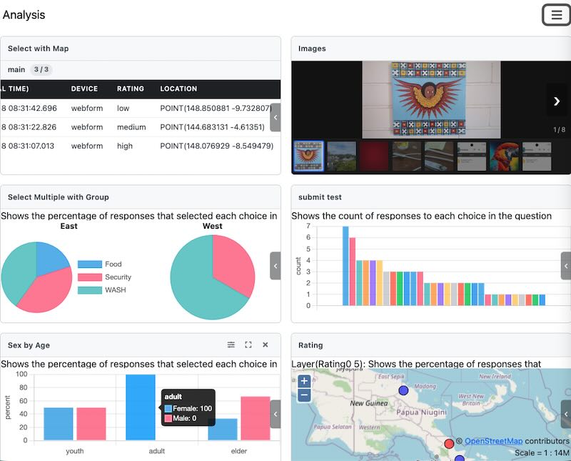
An Example Smap Dashboard
Managing Panels
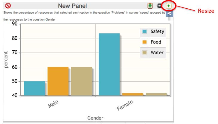
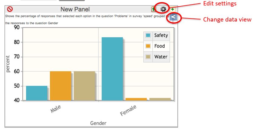
Panels have buttons at the top right to resize, edit settings, and delete. These buttons are visible only when you hover over the panel.
Adding Panels
Adding a Panel
Select Add Panel, then select one of the panel types: graph, table, map, or image.
Resizing a Panel
Resizing a Panel
Panels can be shown in two sizes: expanded to the size of the screen, or minimised so multiple panels can be viewed at once.
Editing a Panel
Editing a Panel
Clicking the settings icon opens the same dialog that was used to create the panel. Clicking the "Data View" drawer opens a side panel that allows selection of map layers or subforms in a survey. For a graph created from select question responses, you can choose which options are shown.
Closing a Panel
A panel can be closed by clicking the X at the top right.
Panel Settings
Subject
For all panel types, the default subject is "Data". However, for table and map panels, you can select one of:
Data
User Activity
User Locations
Data shows information collected for a specific survey, including answers to survey-specific questions.
User Activity shows information about the activities of a specific user for all surveys they have completed. This information includes metadata about a survey:
Location
Survey name
Upload Time
Start Time
End Time
Device
Comments on survey
Instance Name
Scheduled Start (For tasks)
User Locations
For a map panel, this shows the location where users last refreshed FieldTask. Each user's location is represented by a coloured circle with their name shown in red next to it. The circle colour changes depending on how long it has been since they refreshed their phone:
less than 1 hour - red
between 1 and 2 hours - orange
between 2 and 3 hours - yellow
between 3 and 4 hours - green
more than 4 hours - blue
For a table panel, the last refresh time is shown for each user.
Only users who are members of the currently selected project will be shown.
To view user locations, you need the security groups analyst or
view data. If the user only has view data, they are restricted to
viewing only the locations of users with the same security role, or users with
no security role if the dashboard user does not have one.
Warning
If no location is available with the last refresh, the user will not be shown in either the map panel or the table panel.
Survey
Select the survey whose data you want to show. This option is used only with "Data" subjects.
User
Select the user whose activity you want to show. This option is only for "User Activity" subjects.
Graph Panels
After you select the survey, you must select a question to analyse on the graph. Alongside each question, you can select the function that is applied to the data. This can be either:
Percent (The percentage of responses with this value, or the percentage of responses within the group that had this value)
Count (Counts of responses with this value)
There are two graph types:
Histograms (Shown as a Pareto chart - limited to the largest 30 values)
Pie Charts
Data is shown as a time series if you select a time interval. For example, if you select an interval of week, values are shown on a week-by-week basis.
Question types that can be graphed:
select one
select multiple
text
calculates
server calculations
integer
decimal
Map Panels
Whole of Survey View
It is not necessary to select a question. Select the survey and save. The resulting map shows all locations where data was collected. If you click a point, details of the data at that point are shown.
If you have multiple location questions in a survey, you can select the location question to show on the map.
Map view of a select question
When creating the map panel, specify a question to analyse. This works best
for select_one or select_multiple question types.
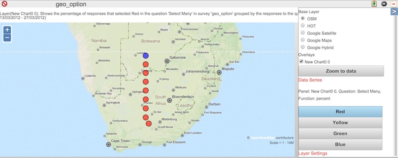
Question level map view
The locations are colour coded according to relative frequency:
Red: High
Orange
Yellow
Green
Blue: Low
These frequency values apply to one of the choices in the question. To view the results for a different choice, select that choice in the drawer to the right of the map.
If a location contains only a single record, it is coloured "red" if the choice was selected, or "blue" if the choice was not selected. However, if you have more than one record clustered at a single location, you will see the range of colours described above, depending on the percentage of times that choice was selected.
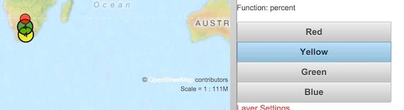
Question level map view zoomed out to show clustering
Table Panels
Table panels are useful for viewing all data collected in a survey. They show 200 records at a time, and you can page through all records using the next >>> and previous <<< buttons.
If you open the drawer on a table panel, you can apply actions to the data, such as backing it up or importing new data. Refer to Archiving of Survey Data, Deleting and Restoring Data, and Backup and Import of Survey Data.
Bad Records
Records that have been deleted are marked as "Bad". These are shown in table panels with a slightly red background. No other panels use bad/deleted records. For examples graphs will not included data from deleted records.
A user can toggle a record from good to bad and back again. To do this the user needs to right click on the cell in the "Bad" column for the record they want to change. Then provide a "Reason" in the popup dialog.
Record Level Operations
Each record has a menu option represented as an ellipses. Clicking on this will open a dialog. On this dialog the user can select an option to:
edit the data
download a PDF of the record
Show the record data in an expanded view where each question for a single record is shown on one line
Image panels
Image panels will show the images in a survey. An image thumbnail is shown at the bottom of the panel and you can select this in order to see the full size image.
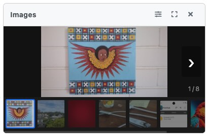
An image panel
Filters
You can apply filters. This can include a date range filter, where you select the date question and then choose start and end dates. You can also specify an advanced filter for data values.
Automatic Refresh
This can be enabled for a specific organisation in the Organisations tab on the Users page. You will find it under "Other Options". Setting a value of zero disables auto refresh. Otherwise, you can specify the refresh interval in minutes.
Only charts and maps will be automatically refreshed.